Jacobs
Creative direction –– Visual identity –– Program identity –– Custom typeface –– Illustration –– Brand video –– Motion + sonic direction ––
Brand architecture –– Brand training
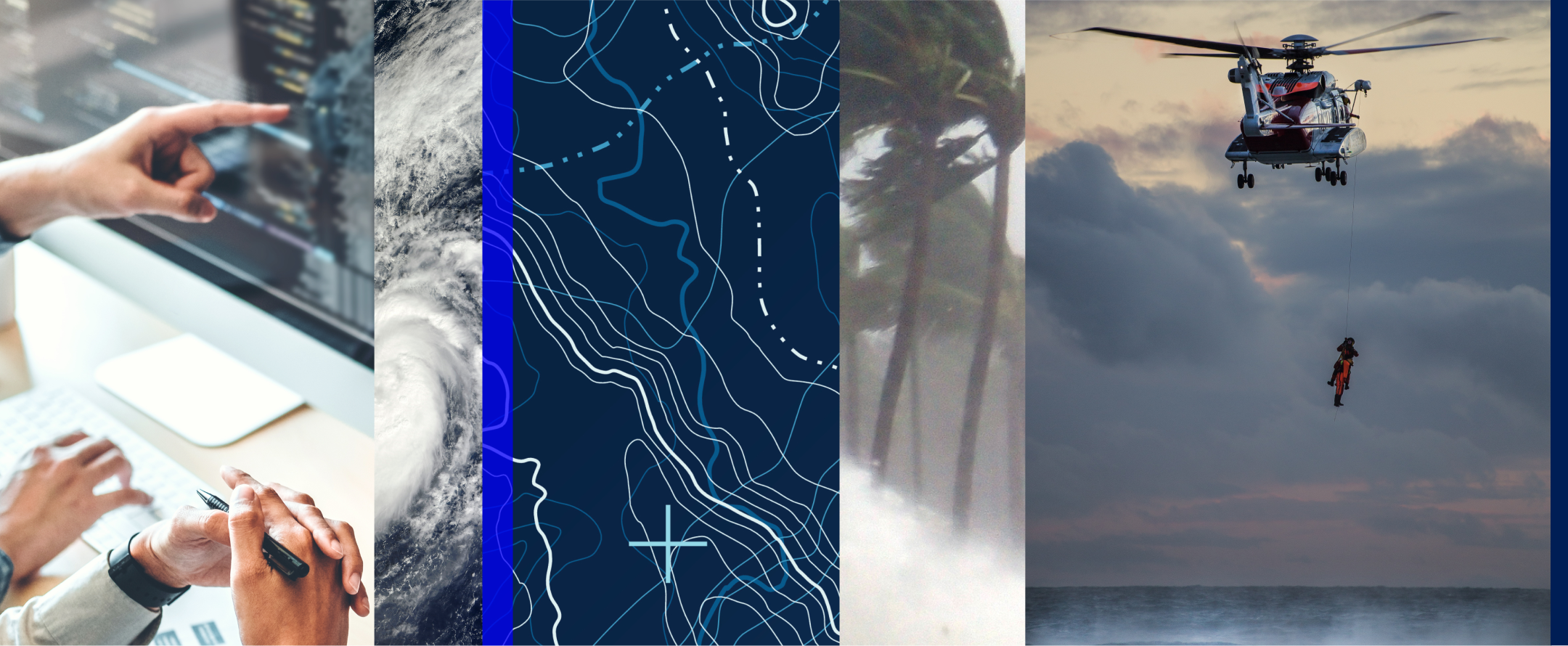
Jacobs provides a full spectrum of professional services including consulting, technical, scientific and project delivery for the government and private sector.
Objective/Challenge
Jacobs Engineering Group had gone from conducting large-scale engineering projects to solving some of the biggest challenges across industries, yet its brand had never caught up with the company it had become. There was an opportunity for Jacobs to rally its 50,000 global employees behind an authentic and foundational story that more accurately reflected all they do—and tell the world about it.
Solution
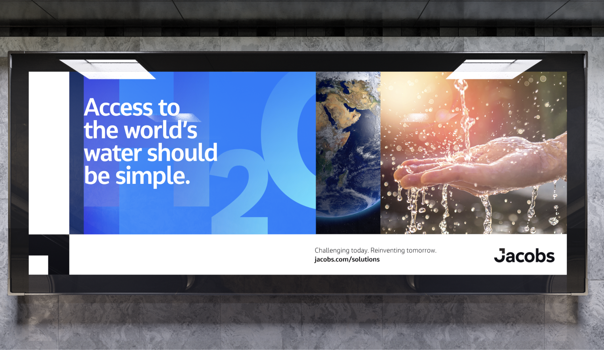
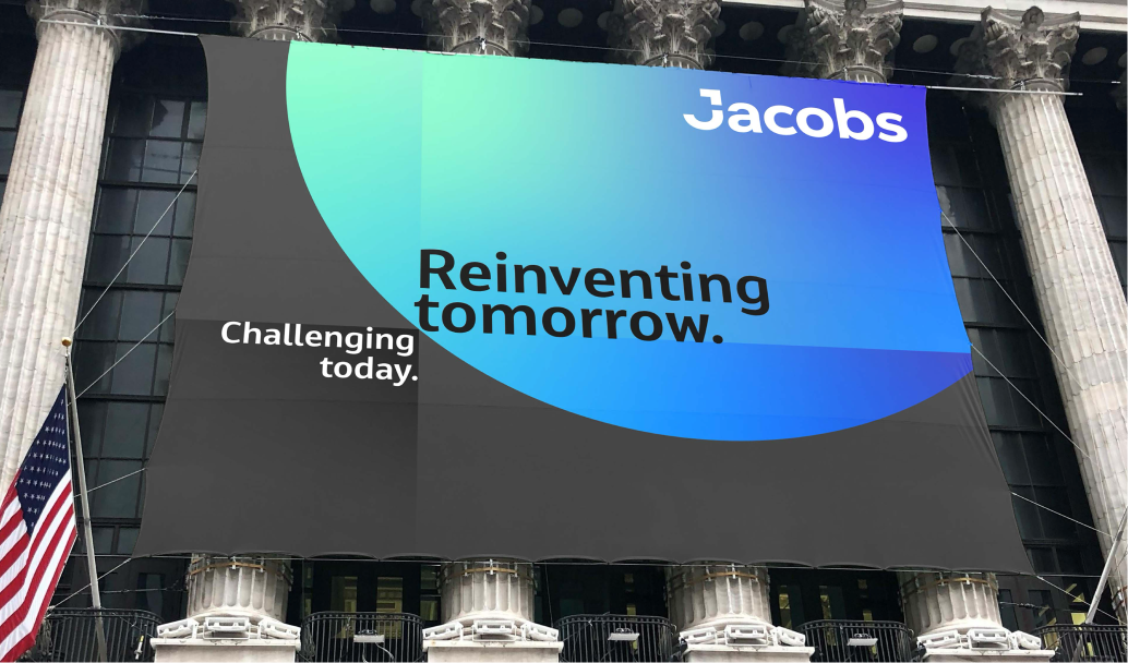
We tell a story of the Jacobs’ transformation and articulate the company’s approach and impact. The new tagline "Challenging today. Reinventing tomorrow." captures the Jacobs mindset and will continue to set them apart.
Brand video ––
People are at the heart of Jacobs and their vision is core to the world they're building.
Created as a rebrand launch companion for internal and external audiences, the brand video tells the story of passion and commitment. An international production that consisted of footage and still photography.
Identity system ––
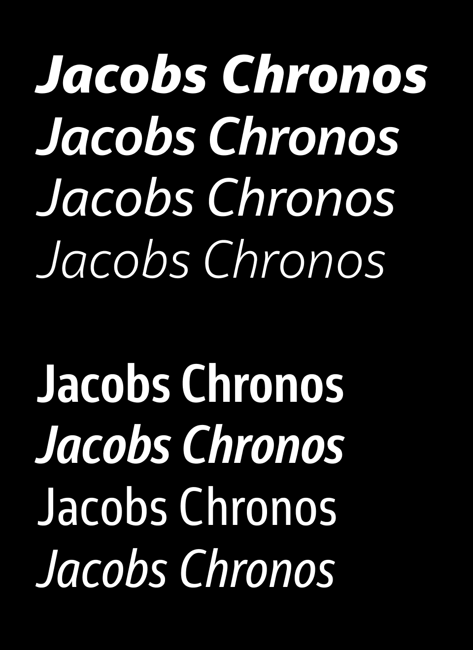
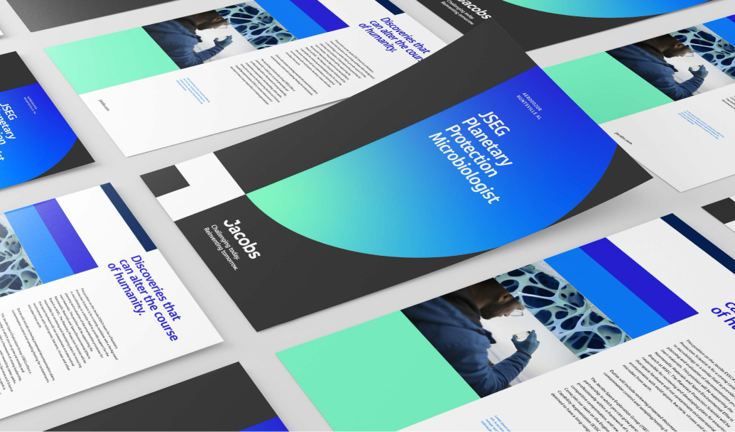
Jacobs' typography spend was substantial. Their technical use of typography demanded a broad family of weights and specific glyph set. The decision to tailor a custom typeface was a no-brainer. They would save financially and unite their global content style system.
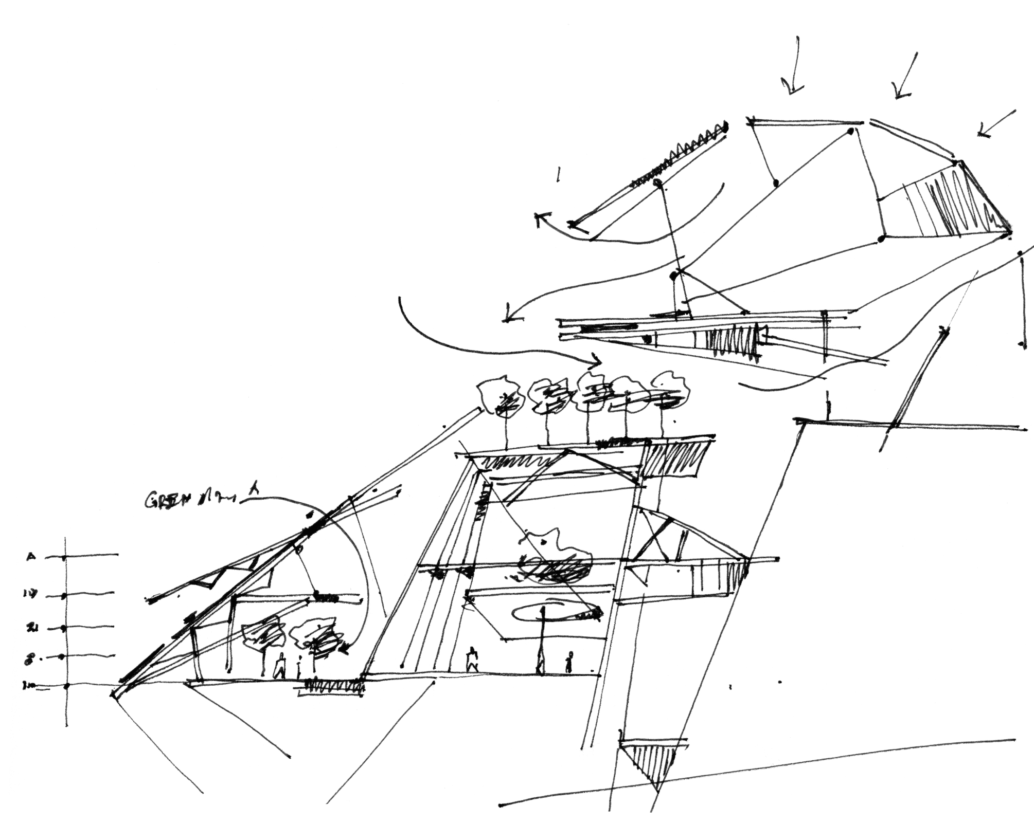
The design system problem and solve was multi-faceted. House an urgency and depth of impact through dynamic stories, consider the necessity of data and allow internal teams to implement with ease and consistency.
NYSE launch ––
"Inflection point" animation ––
Identity system ––
Wayfinding + global office system concept ––
The website was redesigned as a more human and accessible digital experience, grounded in global employee research. The work focused on extending the brand through a people-centred UX and a scalable content structure, strengthening relationships across a complex global organization.
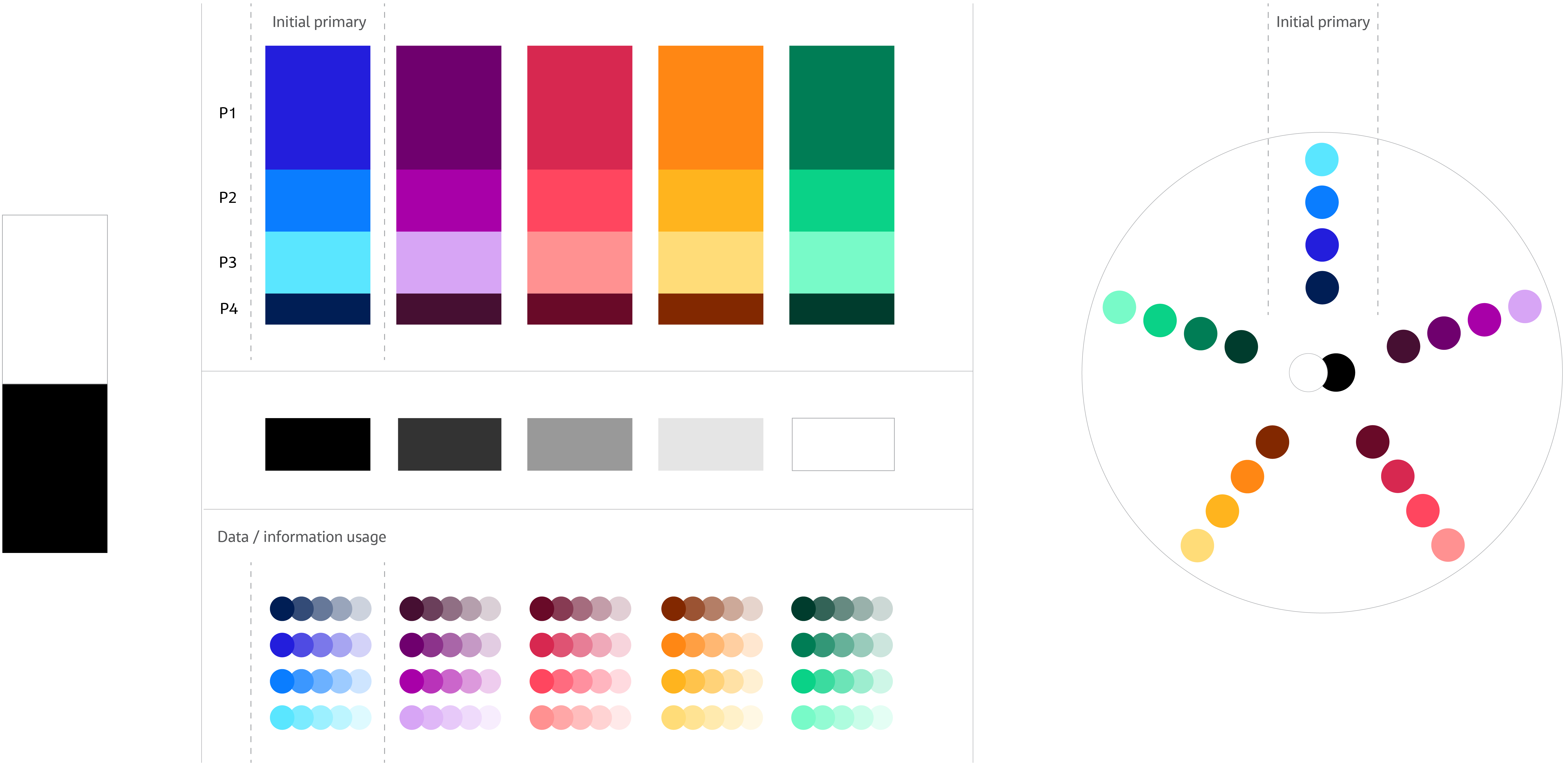
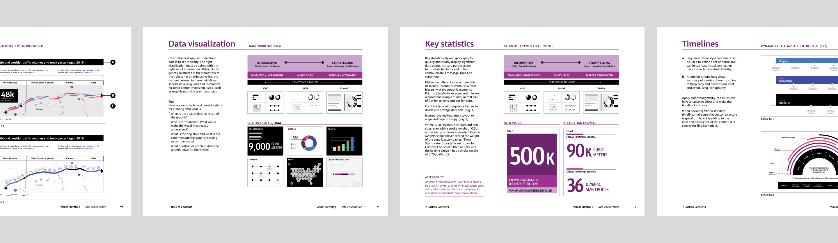
Jacobs asked us to extend their rebrand with a dedicated data visualisation system. Data is central to how they communicate, yet it lacked consistency across teams and platforms. We created clear data guidelines that bring alignment to Jacobs-owned and white-label interfaces, enabling global teams to communicate complex information clearly and on brand.
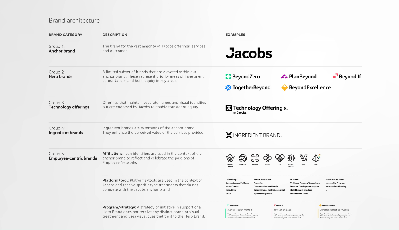
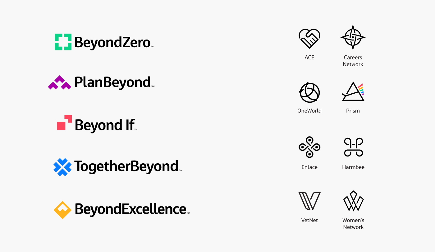
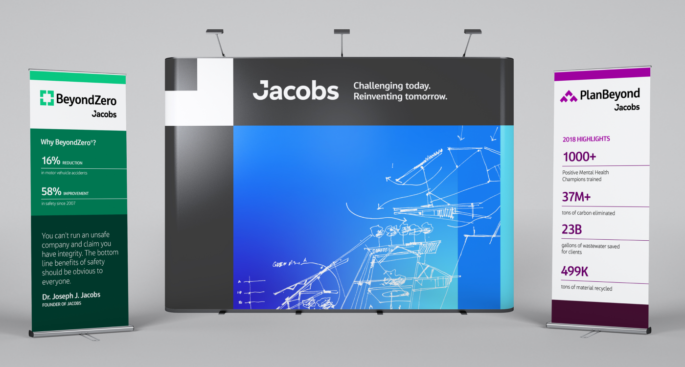
Brand architecture + program identity ––
A scalable, audience-first brand architecture brought clarity and coherence to a complex portfolio. By elevating the anchor brand and clearly defining the role of programs, technologies, and offerings, the system strengthened brand equity, reduced fragmentation, and enabled consistent, scalable growth.