Affinius Capital
Visual identity –– Brand video –– Motion + sonic direction –– Brand training
Affinius Capital are a real estate investment management firm building the asset verticals of the future.
Objective/Challenge
Creating an all-new, not-new financial entity. In 2019 USAA Real Estate became an independent entity. Without the hindrance of financial institution, and a massive global portfolio to invest in, they were poised with growth. However, they had to stop using the valuable and beloved USAA brand by 2023. A brand with a new name, identity and experience was built to point the right way forward.
Solution
Through research and positioning, we showcased territories their stories could occupy and carried forward their legacy through the promise of, forward with honor. A bold and authentic identity is balanced with subtle heritage DNA and a modular visual system that connects across spaces.
Brand video ––
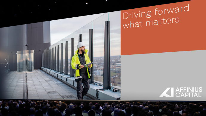
The rebrand began with a deliberate transition story. Leaving the USAA name behind required clarity, reassurance, and confidence, both internally and externally. The launch film introduced Affinius as a new name with continuity of purpose, framing progress and fiduciary responsibility as inseparable ideas and setting the tone for everything that followed.
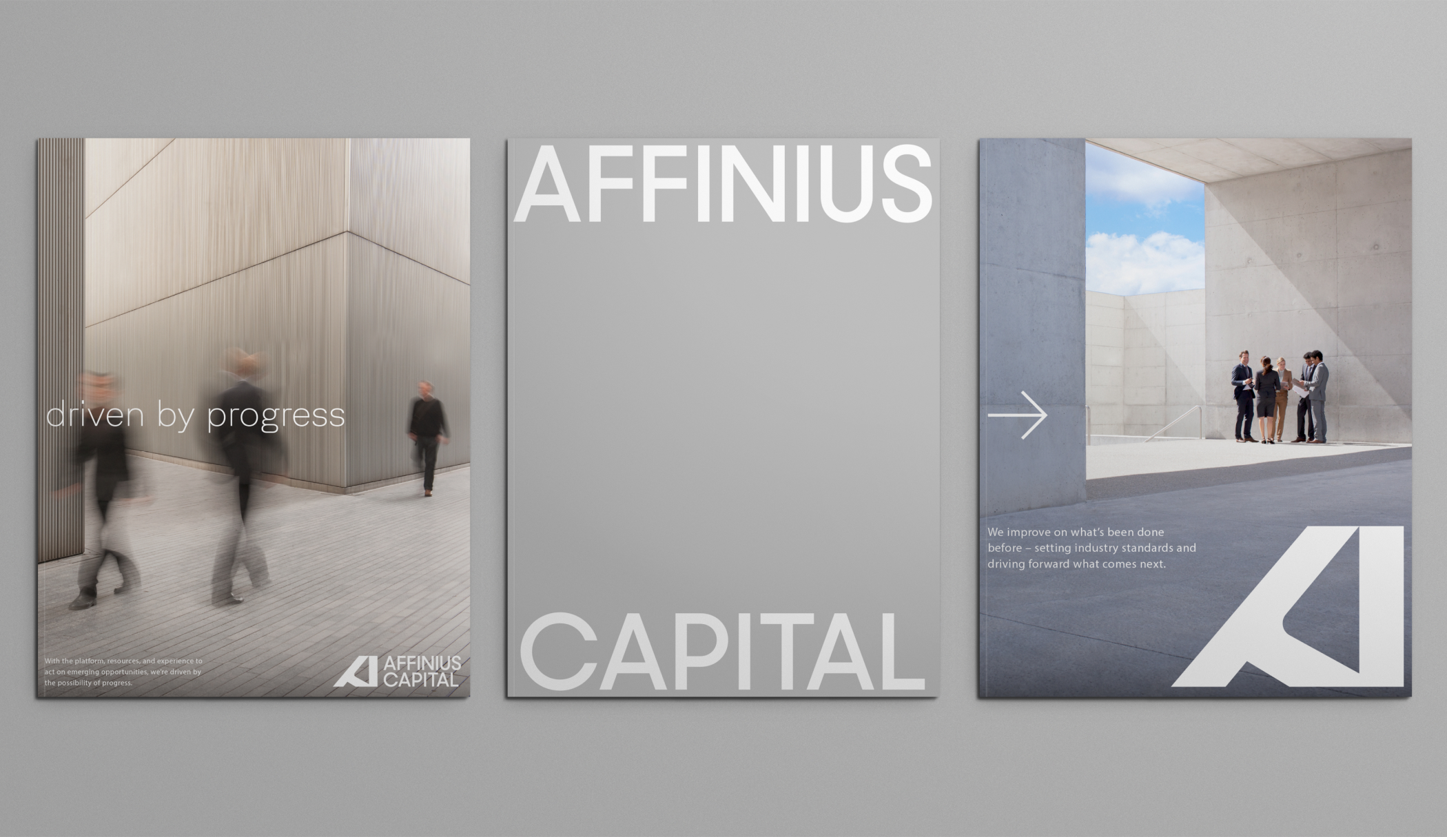
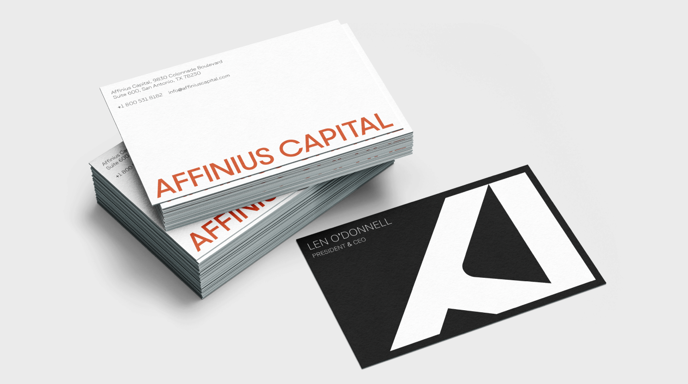
The Affinius mark was designed to signal forward momentum with restraint. Precise geometry and confident structure give the identity a sense of direction and stability, balancing modernity with the seriousness expected of a long-term investment partner. The mark anchors the system without becoming expressive for its own sake.
Brand video ––
Motion plays a supporting role, reinforcing the idea of progress through control and pacing rather than speed or spectacle. Transitions and movement echo the brand’s belief in measured action, helping the identity feel active and contemporary while maintaining discipline and credibility.
Identity system ––
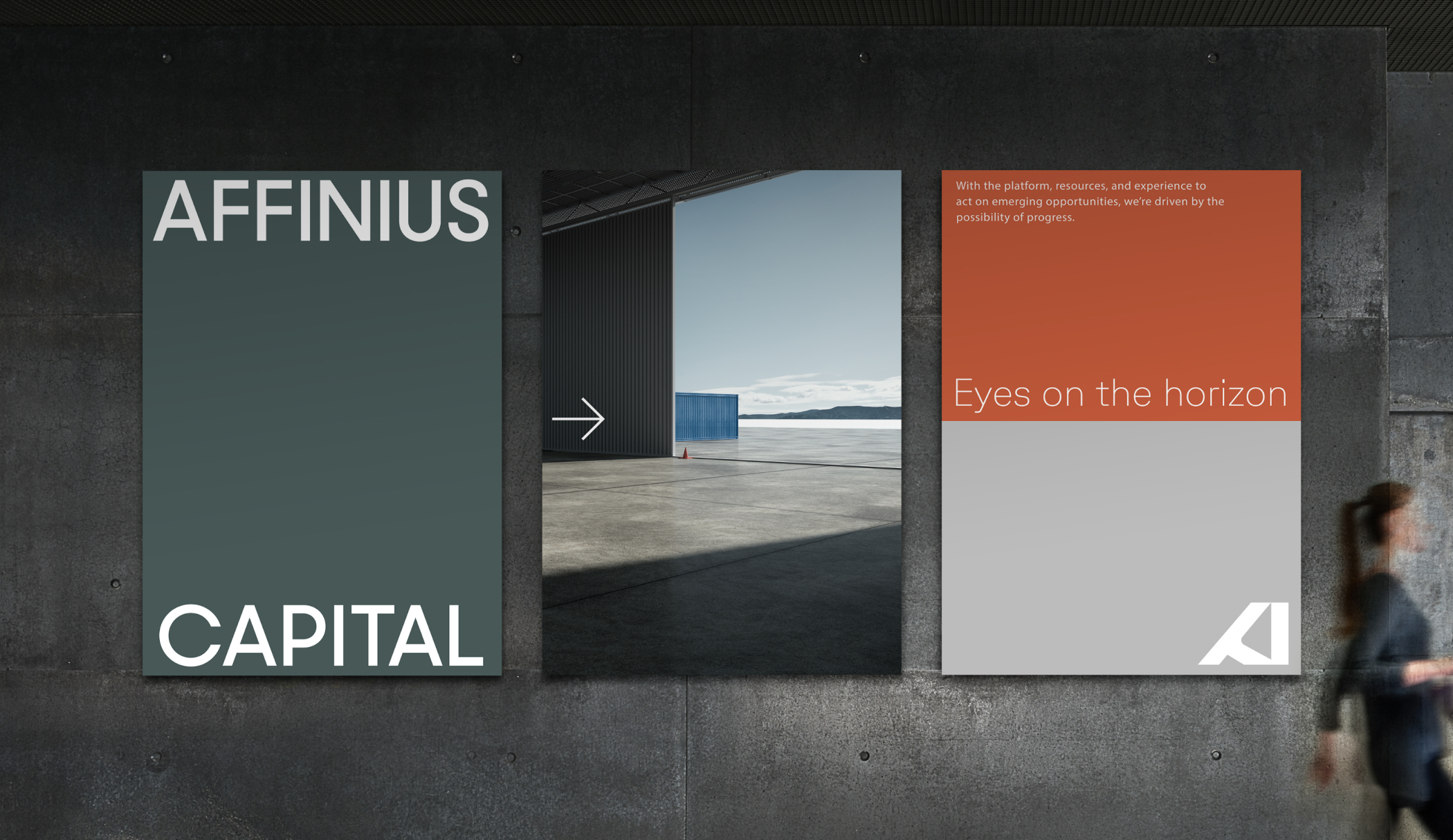
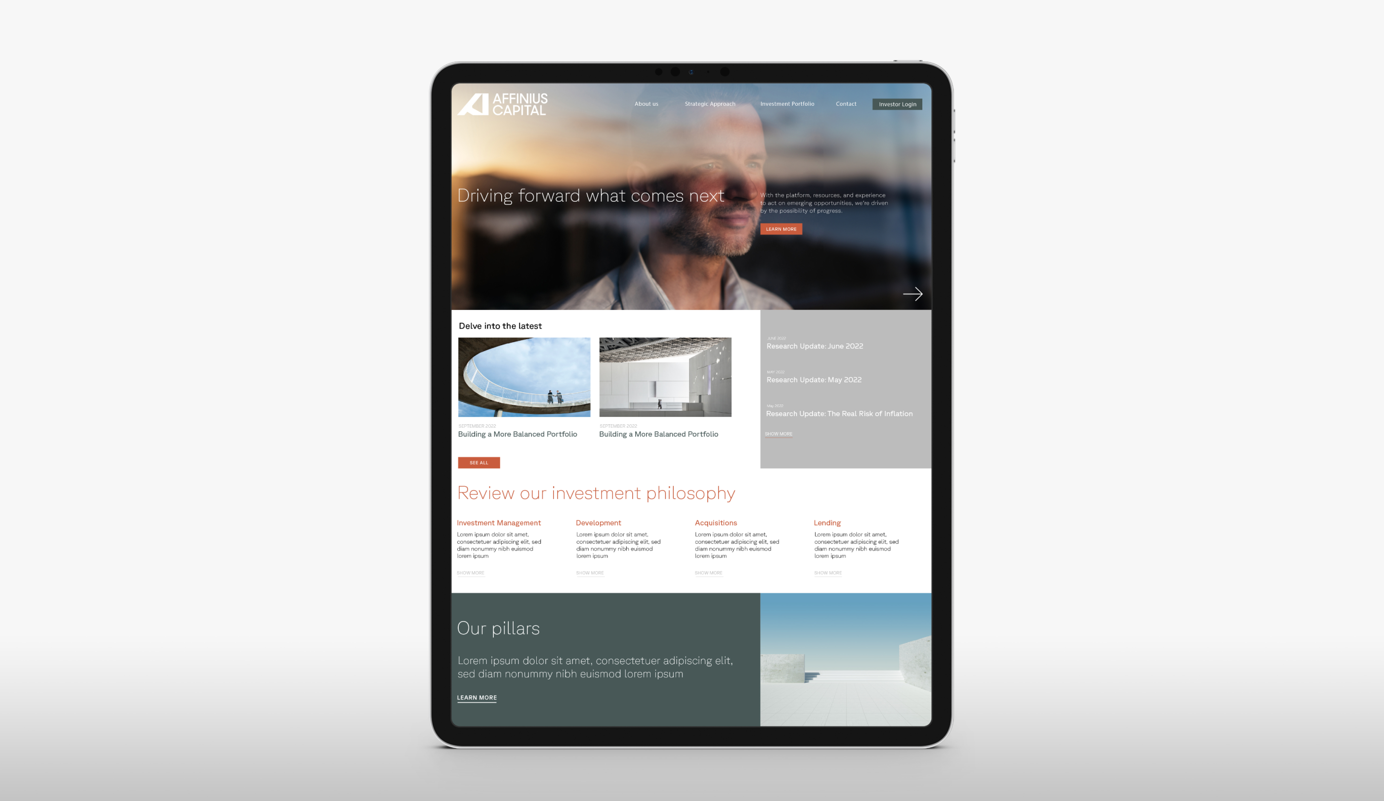
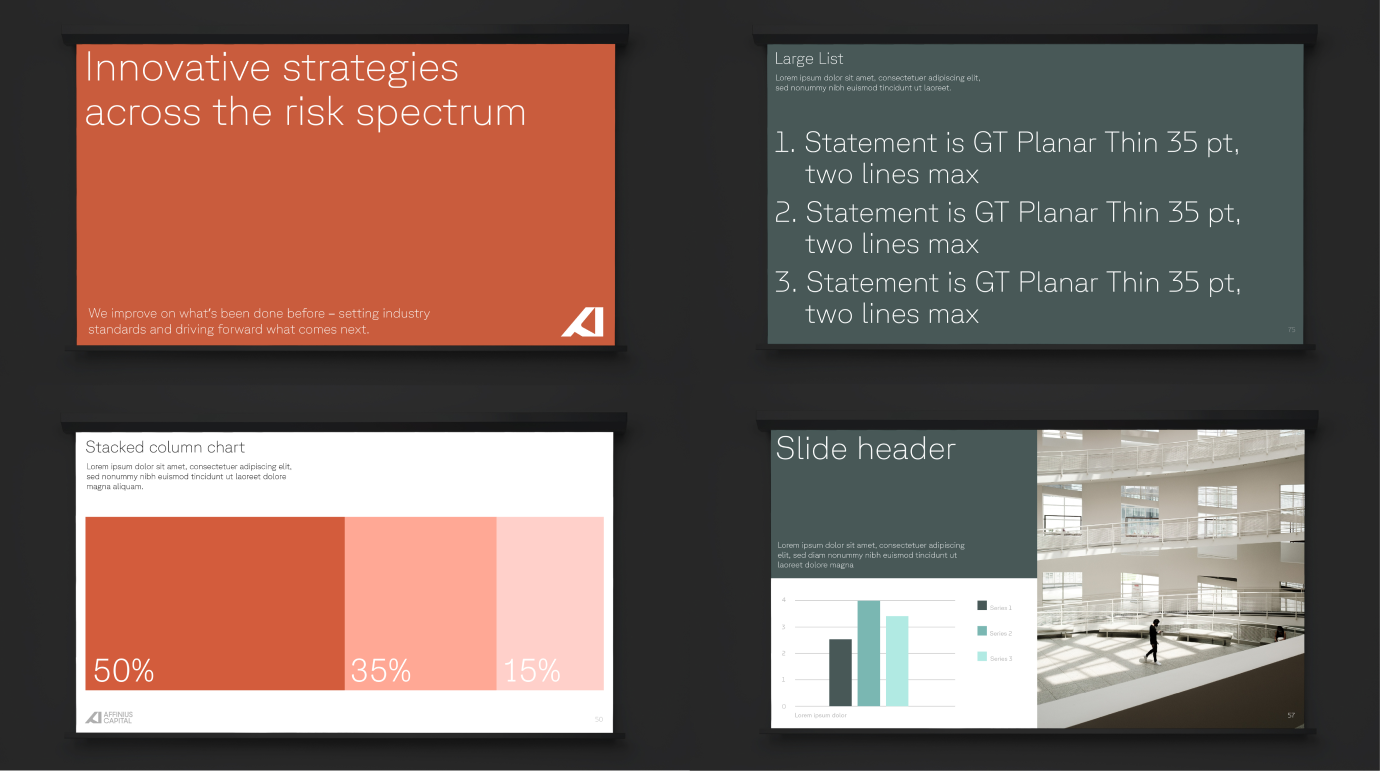
The broader visual system brings clarity to complexity. Strong typographic hierarchy, considered use of color, and architectural layouts reinforce transparency and focus, allowing information to lead. Across applications, the system feels confident and human without becoming casual, aligning closely with the brand’s promise of innovation, transparency, and partnership.
Stationery ––
Keynote ––
Presentation templates ––
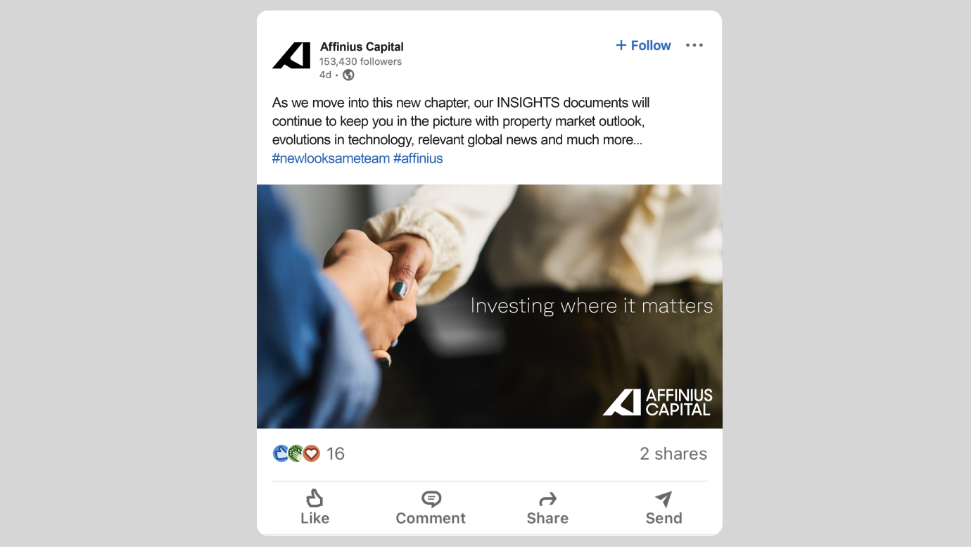
Social ––
Beyond traditional brand expressions, the system extends into more personal, human-facing moments. Social content, Player Cards, and Trend Calls translate the identity into practical tools that support connection, access, and trust. These low-friction, high-impact touchpoints reinforce the brand’s collaborative nature and bring the Affinius promise to life through behavior, not just messaging.
Visual identity –– Brand video –– Motion + sonic direction
CREDITS
Client: Affinius Capital
Role: Creative Director + Design
Agency: Siegel+Gale
Partners: Luceo